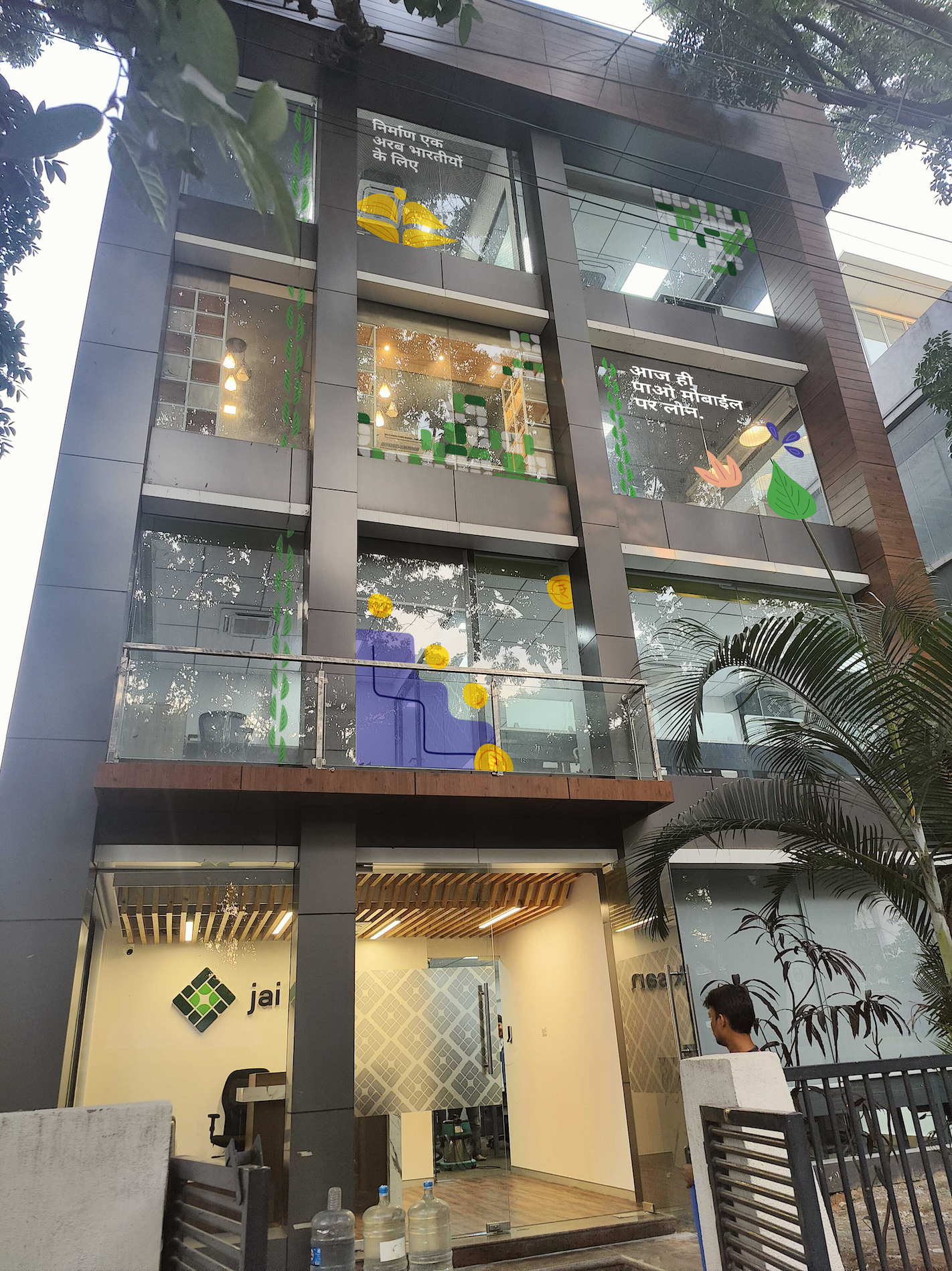
Developing a Visual Language for an Agri-Tech Brand
Jai Kisan offers affordable, tech-driven financial services to Rural India. They support farmers, retailers, and MSMEs by providing timely, accessible credit through advanced technology.
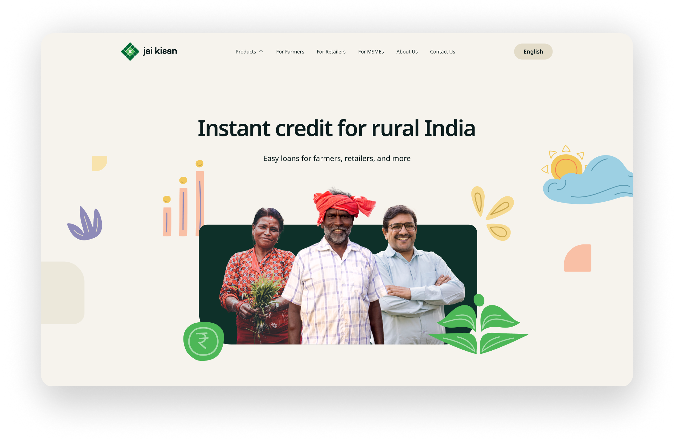
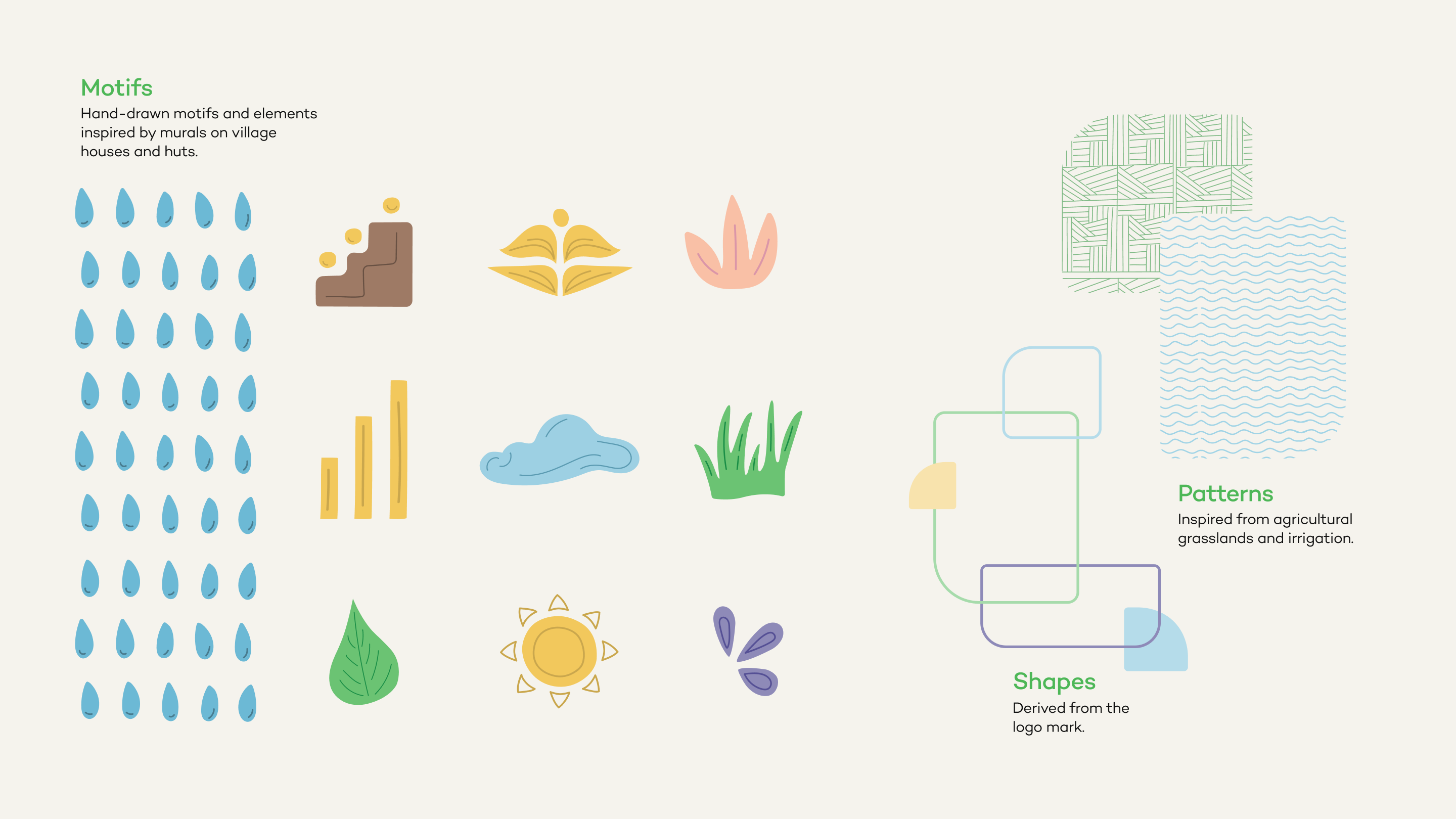
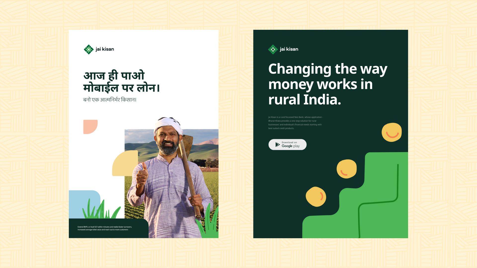
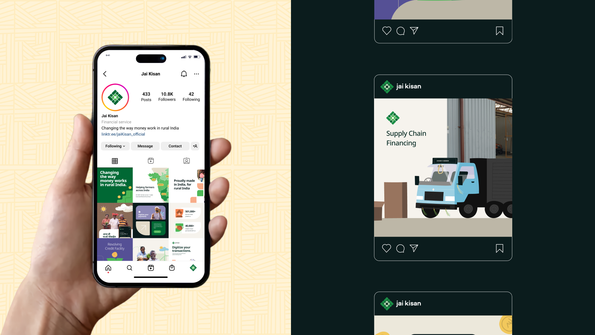
With this focus, the visual language needed to resonate with these audiences. A mixed media approach was used, blending illustrations with images for an engaging and relatable feel. An illustration asset bank was created for easy adaptation across communication materials. This project was developed during my stint at Proximity Works.
View the live website here→
Team
Project Lead - Chitrang Panchal
Logo Design - Chitrang Panchal & Arjun Mahajan
Visual Language - Saakshi Vyas
Logo Loader Animation - Mohit Negi
Framer Development - Farook Ibrahim
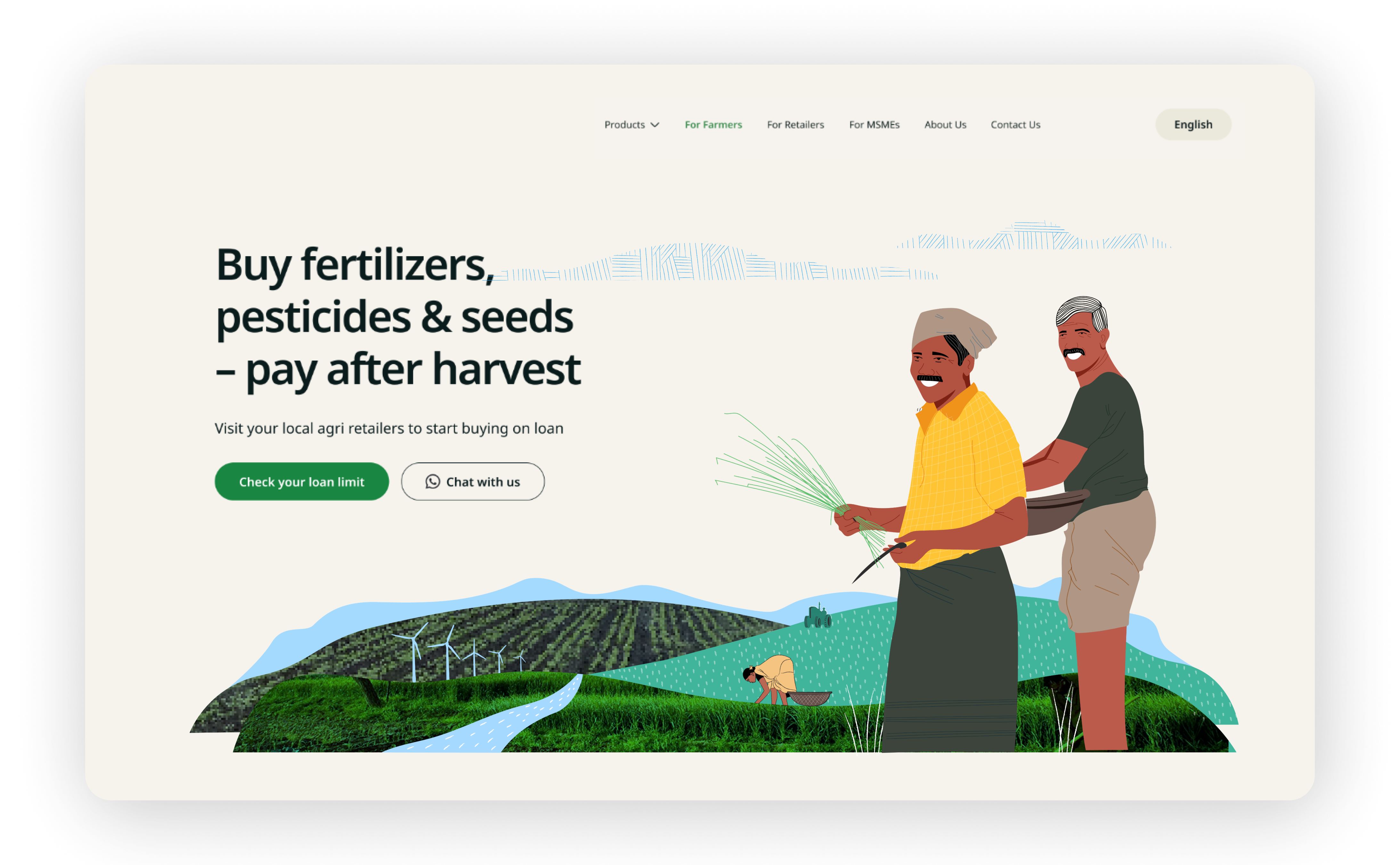
Route 01
This approach centers on storytelling with illustrated farmers and human figures as the focal point. Real-world imagery is incorporated to establish authentic environments, blending illustration and photography seamlessly.
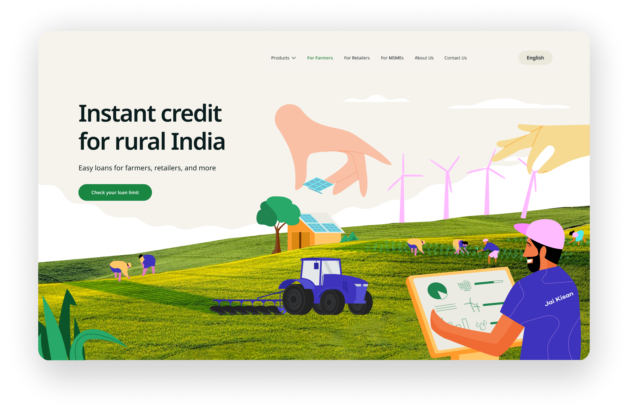
Route 02
Combining mixed media and storytelling, this direction showcases a tech-driven agricultural landscape, with "helping hands" representing Jai Kisan’s role in the industry.
Route 03
This concept emphasizes human-centered imagery, complemented by detailed illustrated backgrounds. Abstract patterns are used to denote graphs, creating visual elements to enhance the overall composition.
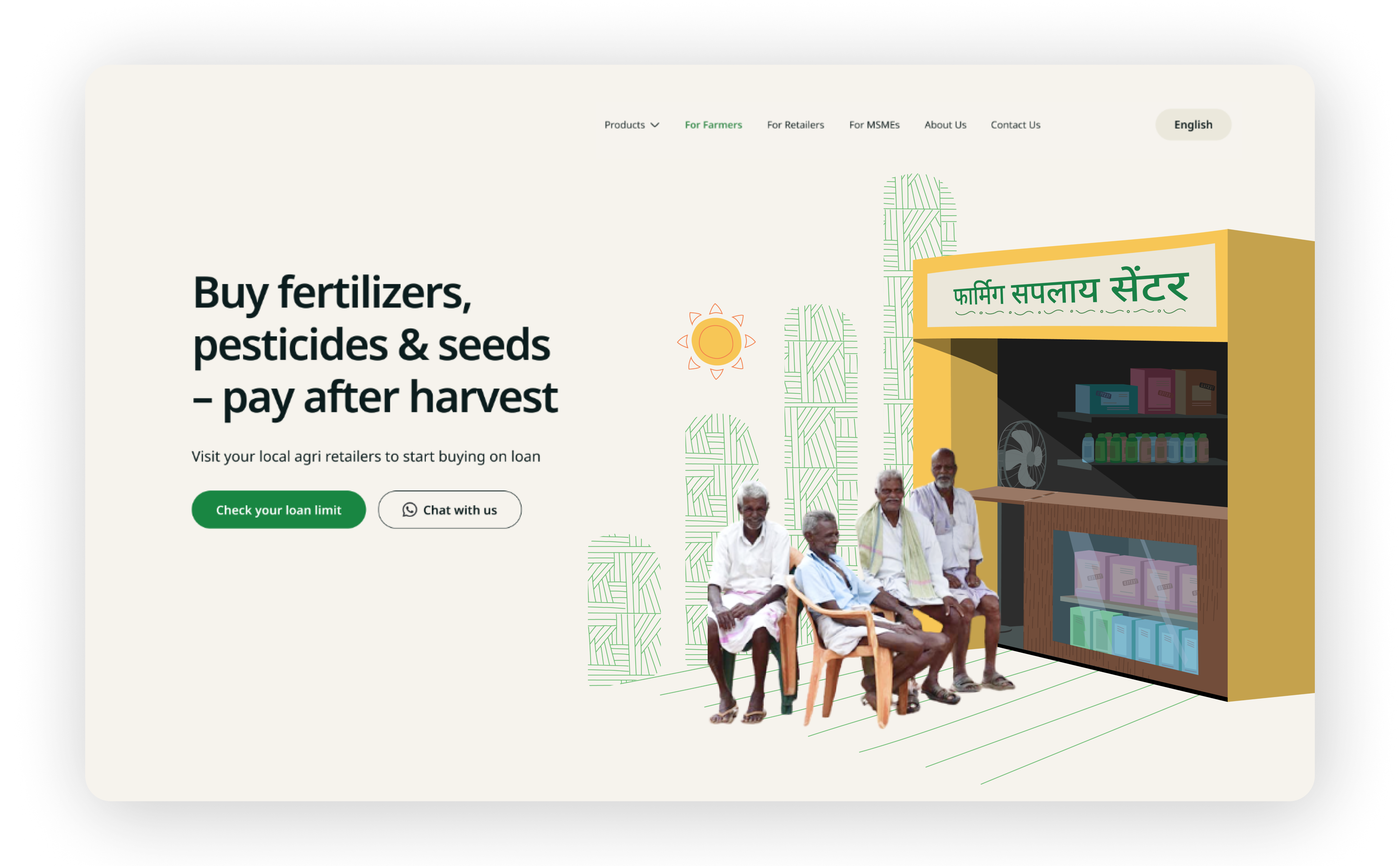
Route 04 - Final
Targeting farmers, retailers, and MSMEs, this approach lays emphasis on trust, security and goodwill, hence it was crucial to include images of real people for relatability. Simple, easy to understand hand-drawn motifs and patterns were developed. These were used as supporting elements for the mixed-media style.
